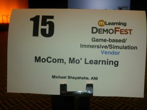
 After years of seeing oh-so-cool demos at the various eLearning Guild conferences, I finally threw my hat, er, my demo in the ring at mLearn’s DemoFest 2015. The result was quite surprising.
After submitting, then receiving notification that I’d be presenting my demo, I immediately began constructing my project, “MoCom, Mo’ Learning”.
Back to Basics
While creating this motion comic – or MoCom, as it’s affectionately labeled – I head a fairly clear set of goals:
- Illustrate the basic visual concepts behind MoComs and how these concocts support effective learning and communication
- Provide an alternative to existing static content in a more engaging presentation
- Ensure this new environment allowed for rudimentary learner-centric interaction by implementing touch/gesture controls
- Showcase the built-in HTML5 tools/capabilities in Adobe Edge Animate
- Explain the major difference between MoComs and regular animation/movies
- …and ensure all of the above is easily designed, authored, executed, and implemented in a very short turnaround time-frame (“low hanging fruit”, so to speak)
Why these specific goals?
As a developer, I’ve seen too many projects bloated – in both scope and budget – by grand gestures intended to forcibly inject some measure of coolness or innovation-du-jour, which seemingly offer little additional value to the learner, other than a visual refresh. Why spend all of this time and money to simply ‘dress-up’ old content if the concept does not add learner-centric value?
MoComs, such as my demo, can easily take existing content and, while adding some visual refresh with subtle motion and/or animatics, create a learning experience where the learner controls both the pacing as well as the overall experience. Additionally, similar to digital comics – such as those found on ComiXology app and other similar apps – learners are able to switch back and forth between a broad, high-level survey of the content/material and drilled-down, deep-dive of the available content.
Professionals’ Interest Piqued
I’m pleased to report that my MoCom demo generated some great discussions and interactions during DemoFest. I saw in some participants a quicksilver-like spark of innovation flash in their eyes, as I told how easily content like this MoCom was to create.
As a final feather in my eLearning cap, “MoCom, Mo’ Learning” won ‘Best of…’ in its category, Game-Based/Immersive/Simulation Solution. I received a flood of emails and Twitter message, asking me for more details, after the webinar of DemoFest winners, where I was able to briefly discuss my demo.
So What?
There are a few of takeaways from this experience. As I’ve said over and over: comics can be a great tool for eLearning, specifically based on their ability to succinctly communicate ideas in concise environments, a.k.a., “panels” (for more information on how effective comics are, see my presentation, “Fantastic 5: Use the Power of HTML5 for Good”).Motion comics can be a great way to enhance stagnant content and allows a more immersive, learner-centric experience. Finally, there seems to be a colossal interest from the professional community on how we can do our jobs – create effective eLearning – within a simple/effective development pipeline, rather than a extravagantly bloated process.

